electrolysis beauty lounge.
our owner, danielle penn, is also a new jersey state licensed electrologist. while in electrolysis school she began creating her visual identity so she could hit the ground running after graduation.
sub-brands. [ beware of laser and @therootofit ]
services. [ logo. website. social media. print. ]
logo.
-
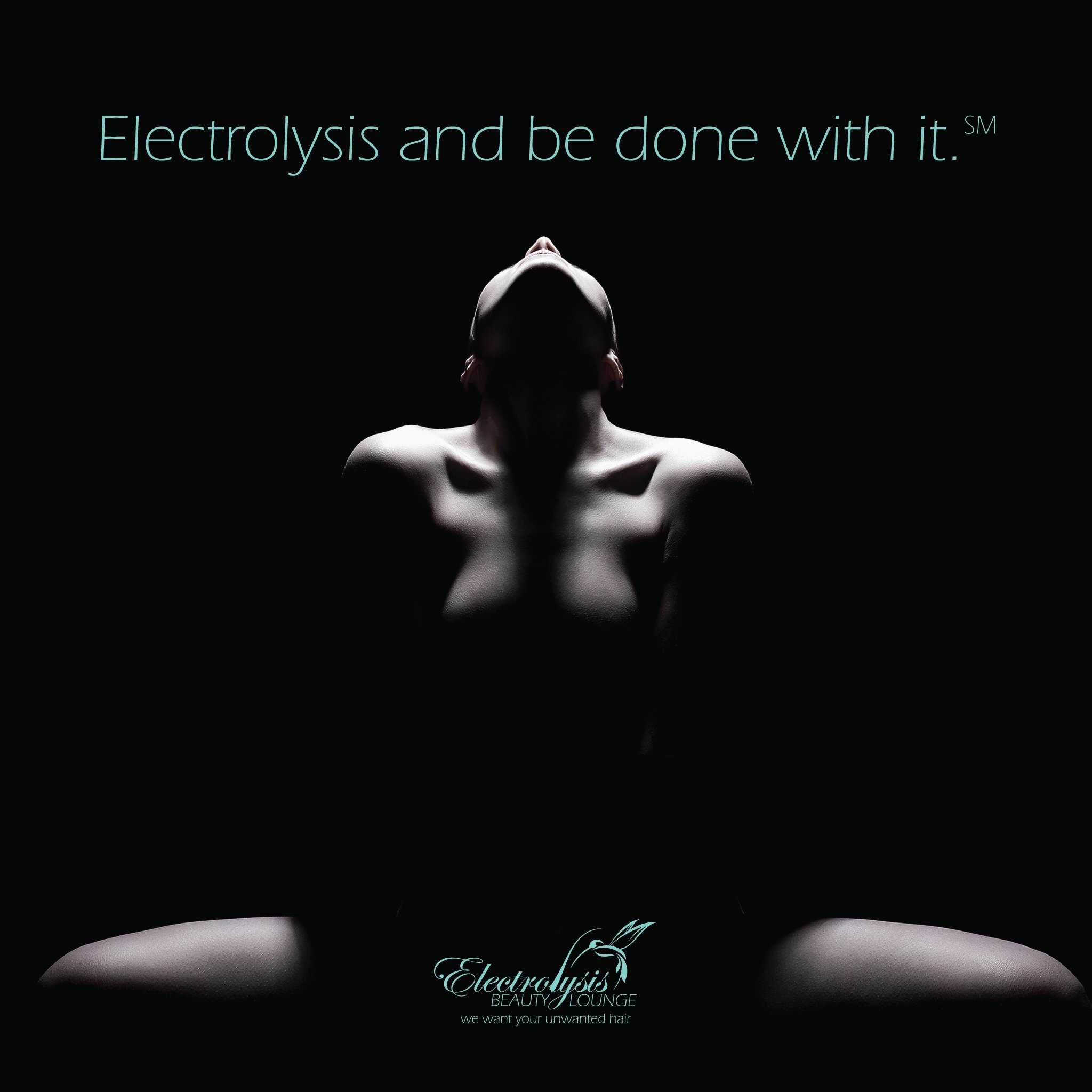
this logo is elegant and clean. since electrolysis is all about removing hair, the second ‘l” in electrolysis was stylized as a single hair, while the hummingbird’s beak is positioned as a probe needle used to administer the electric current would be.
the taglines speak directly to both the purpose and value of electrolysis.
website.
-
the client wanted to the website to be primarily educational so it has a lot of content. electrolysis is over 150 years old but most people either have no idea what it is or think it’s the same a laser hair removal, so we created pages focused on each aspect of electrolysis and that speaks directly to different client types.
-
social.
-
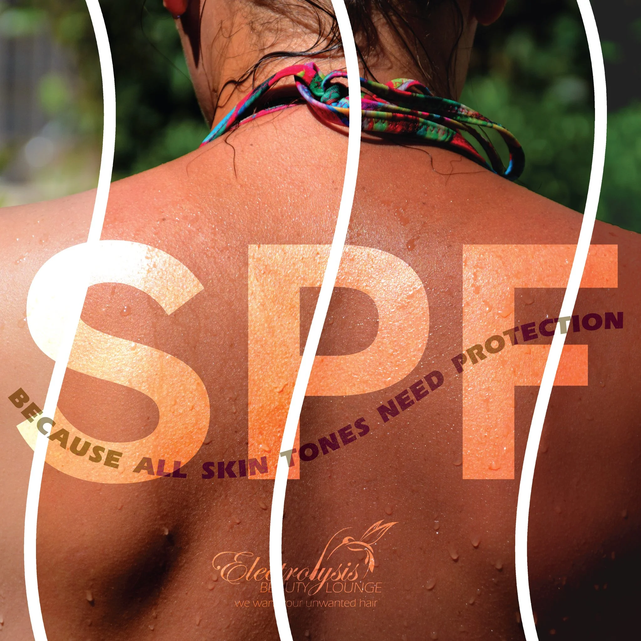
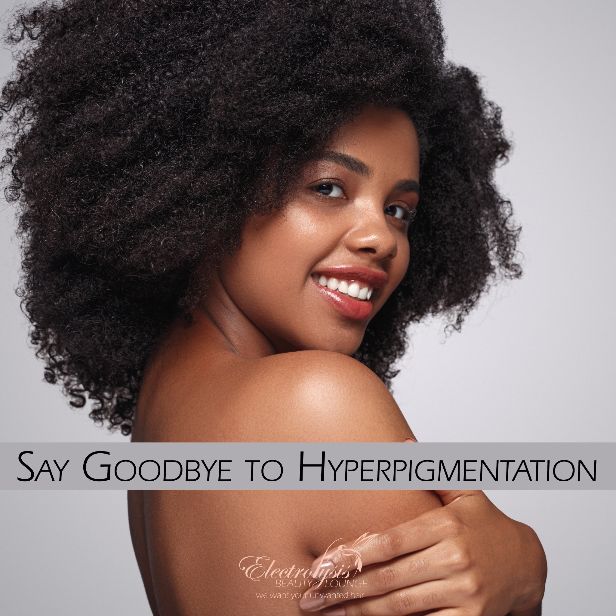
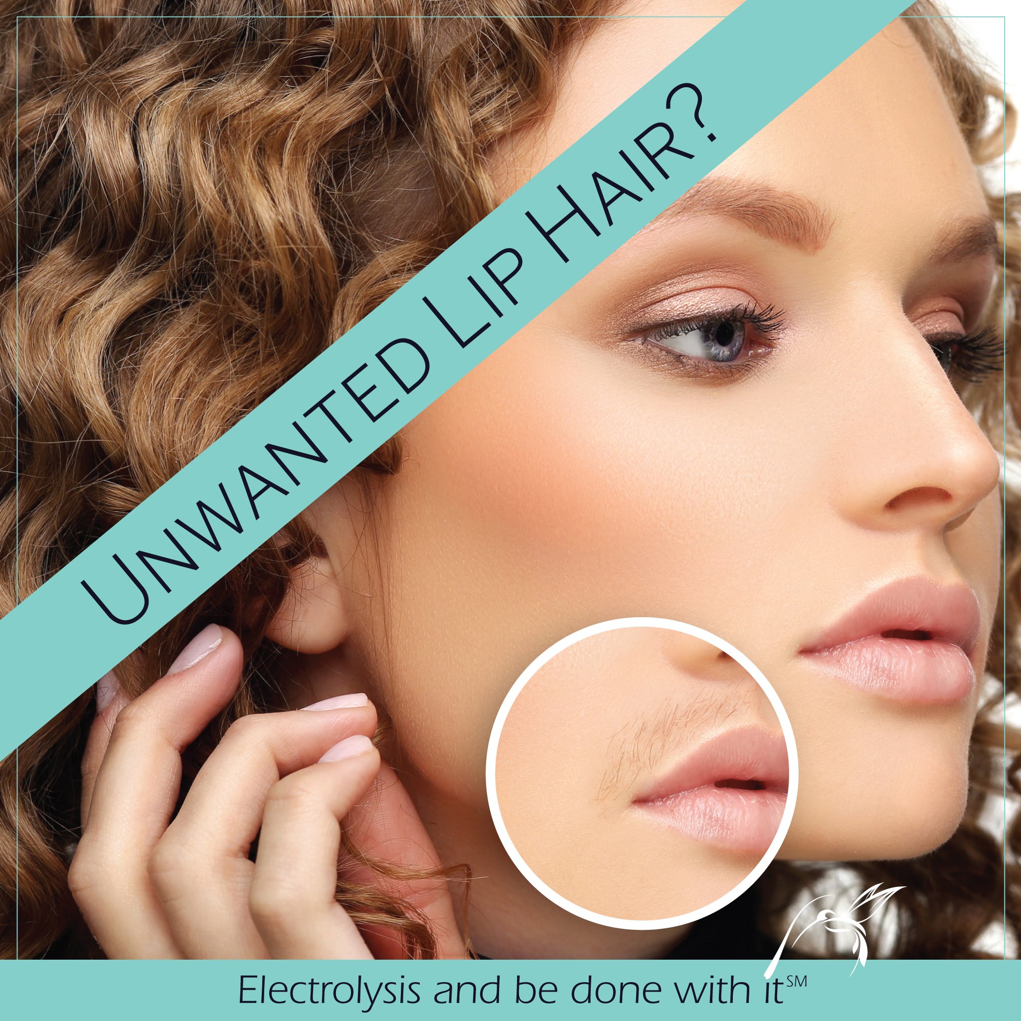
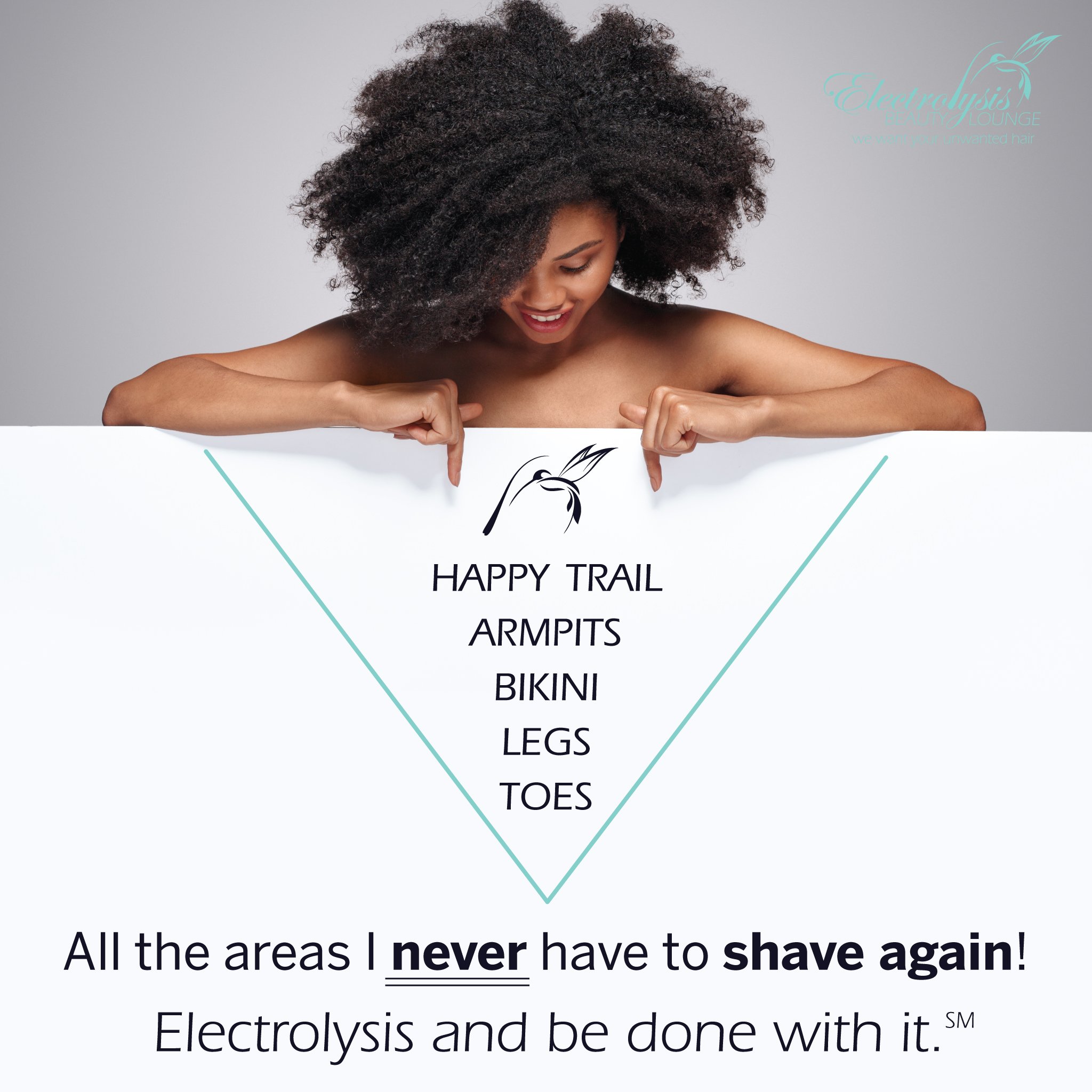
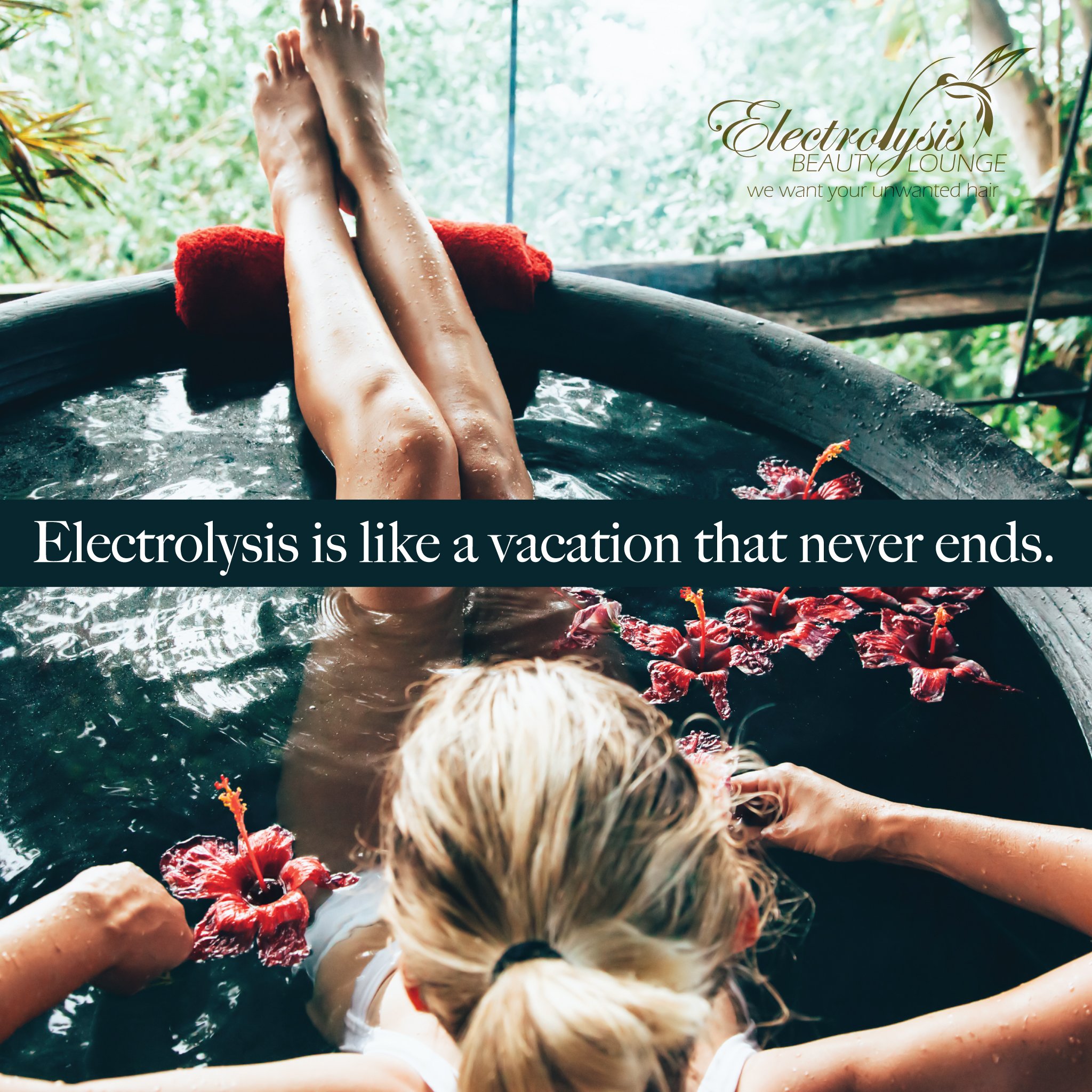
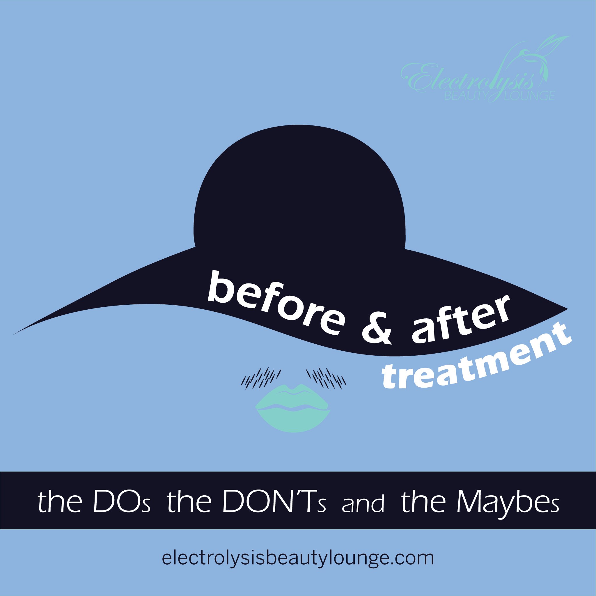
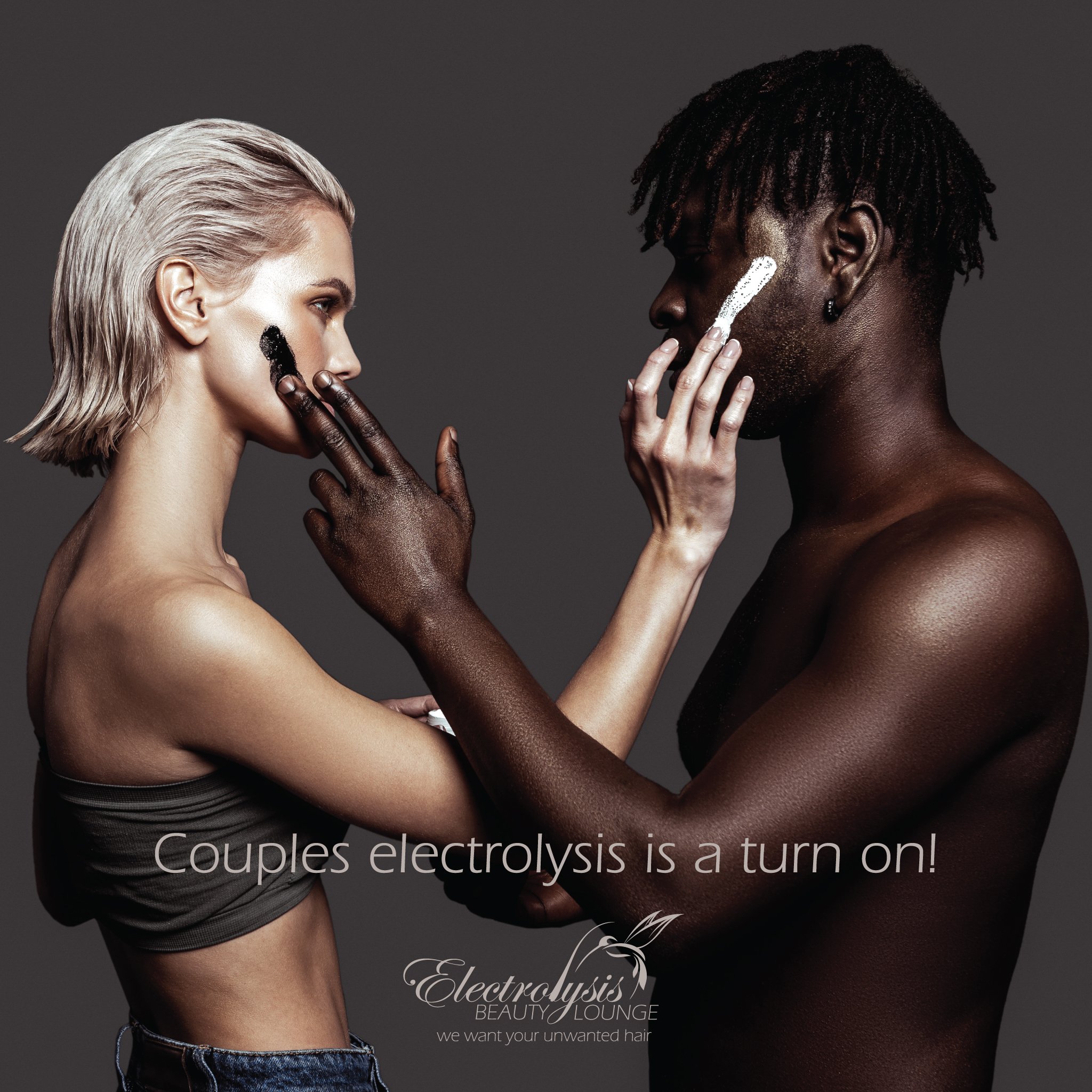
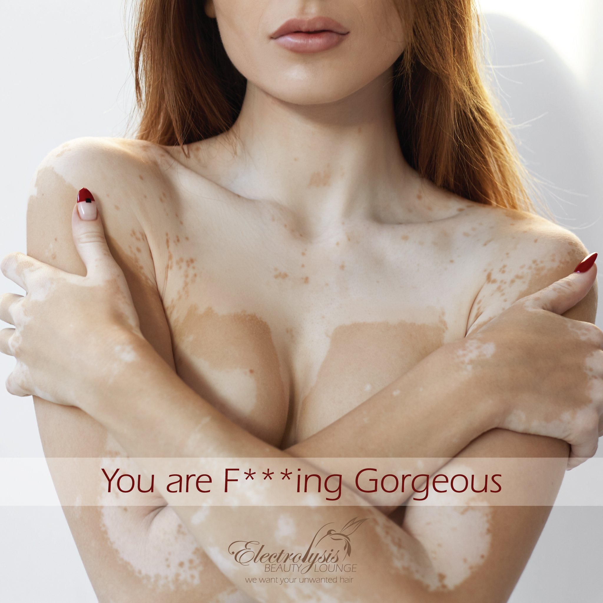
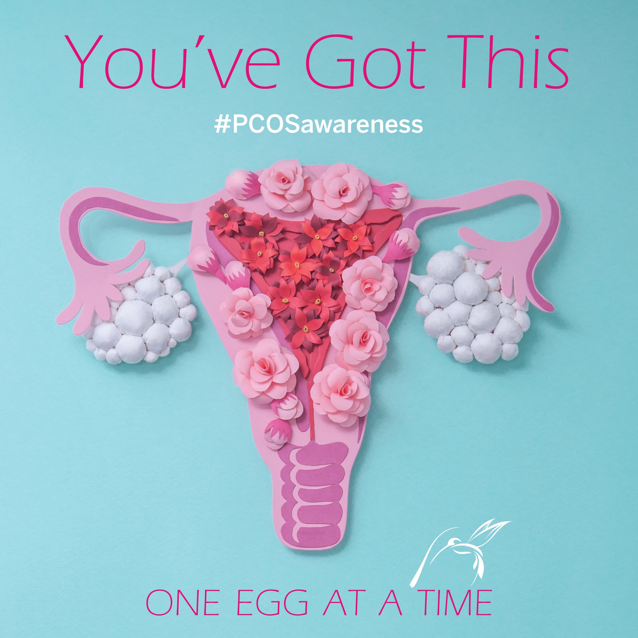
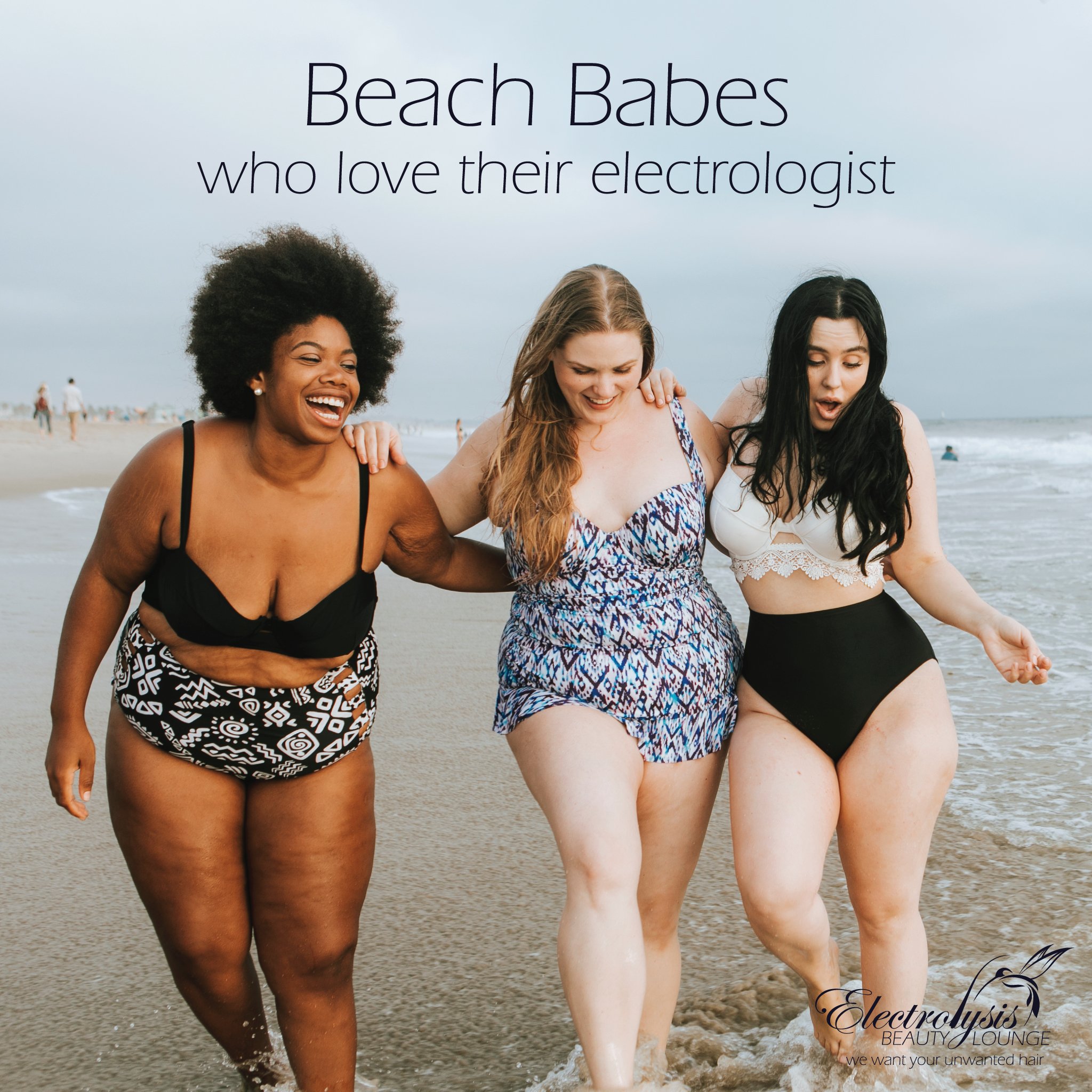
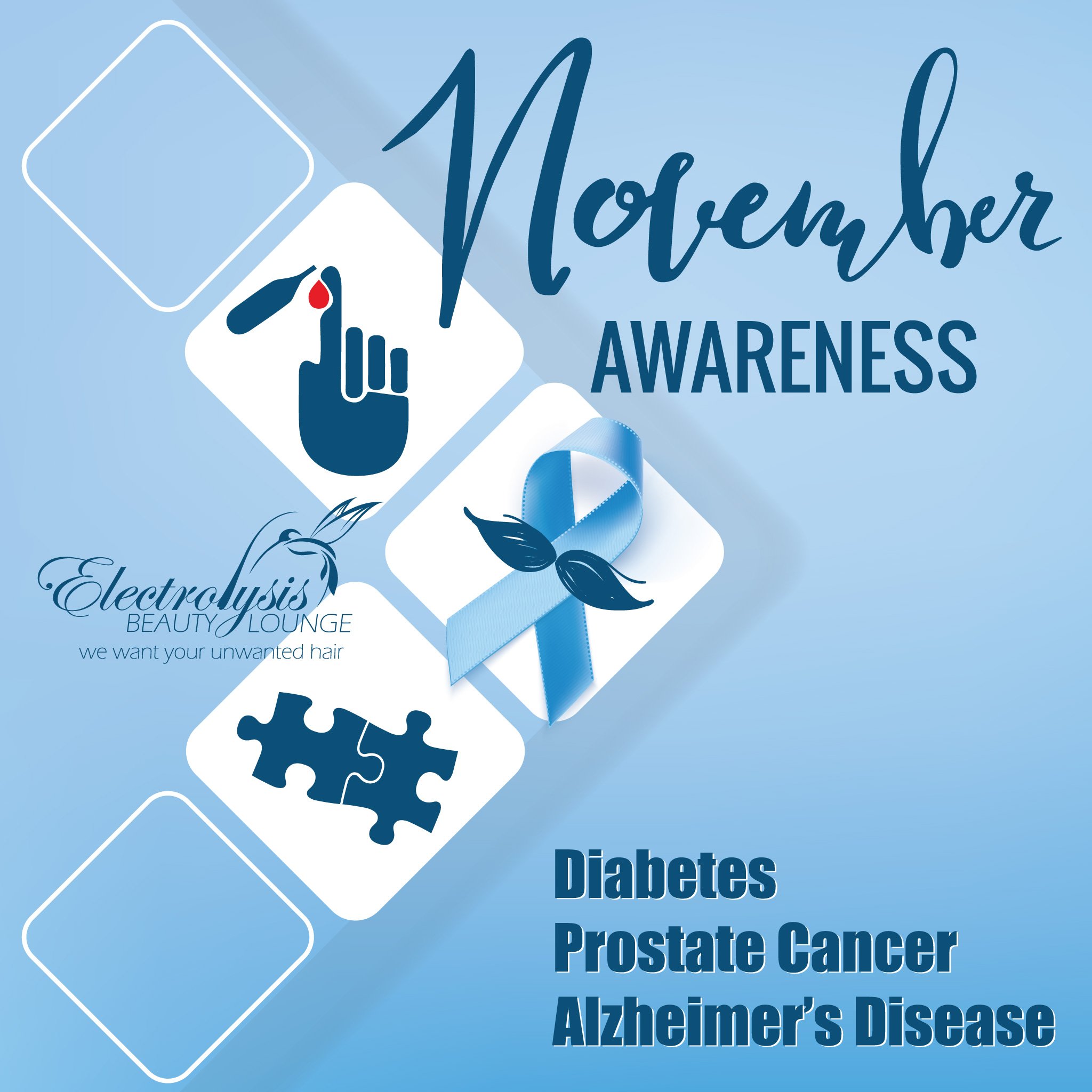
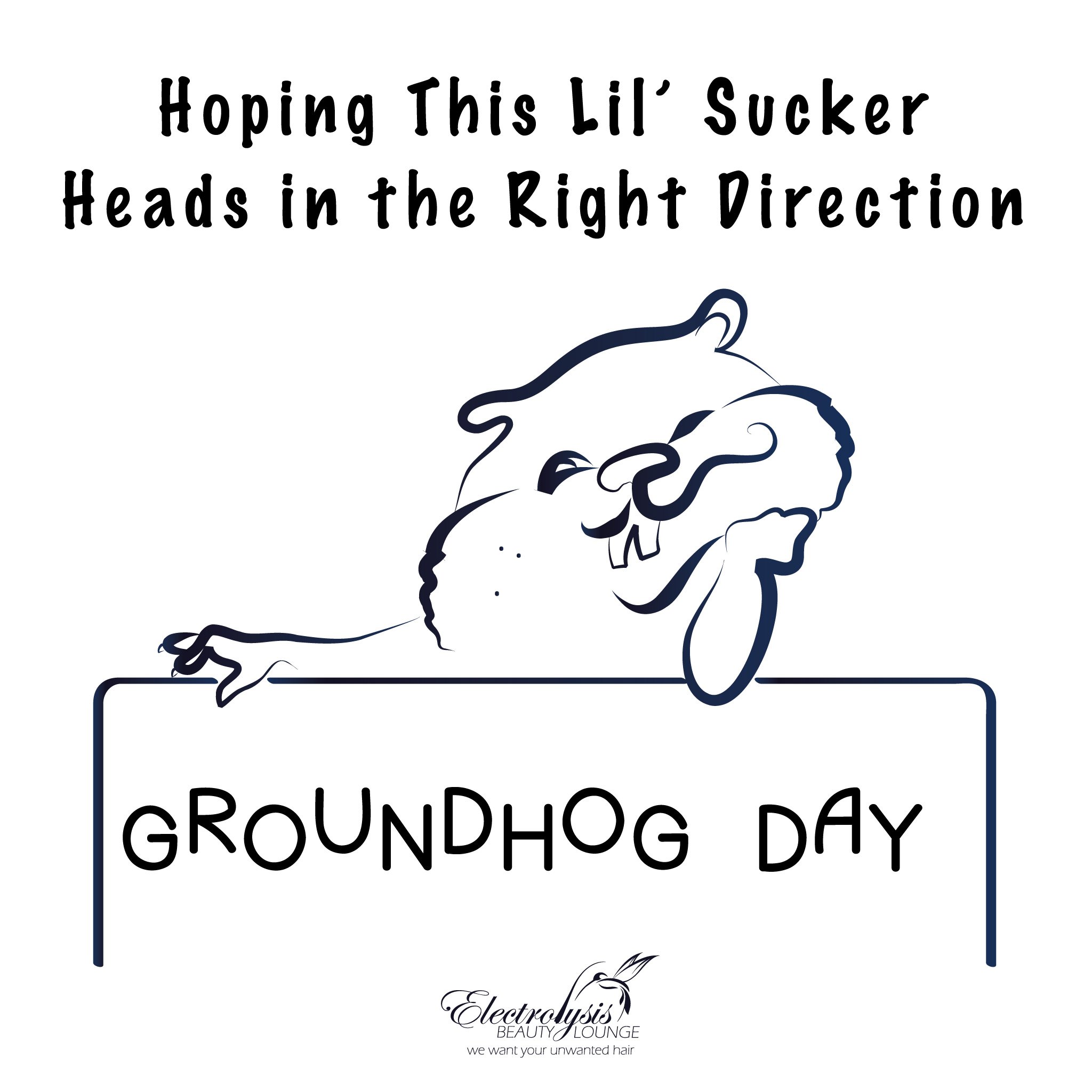
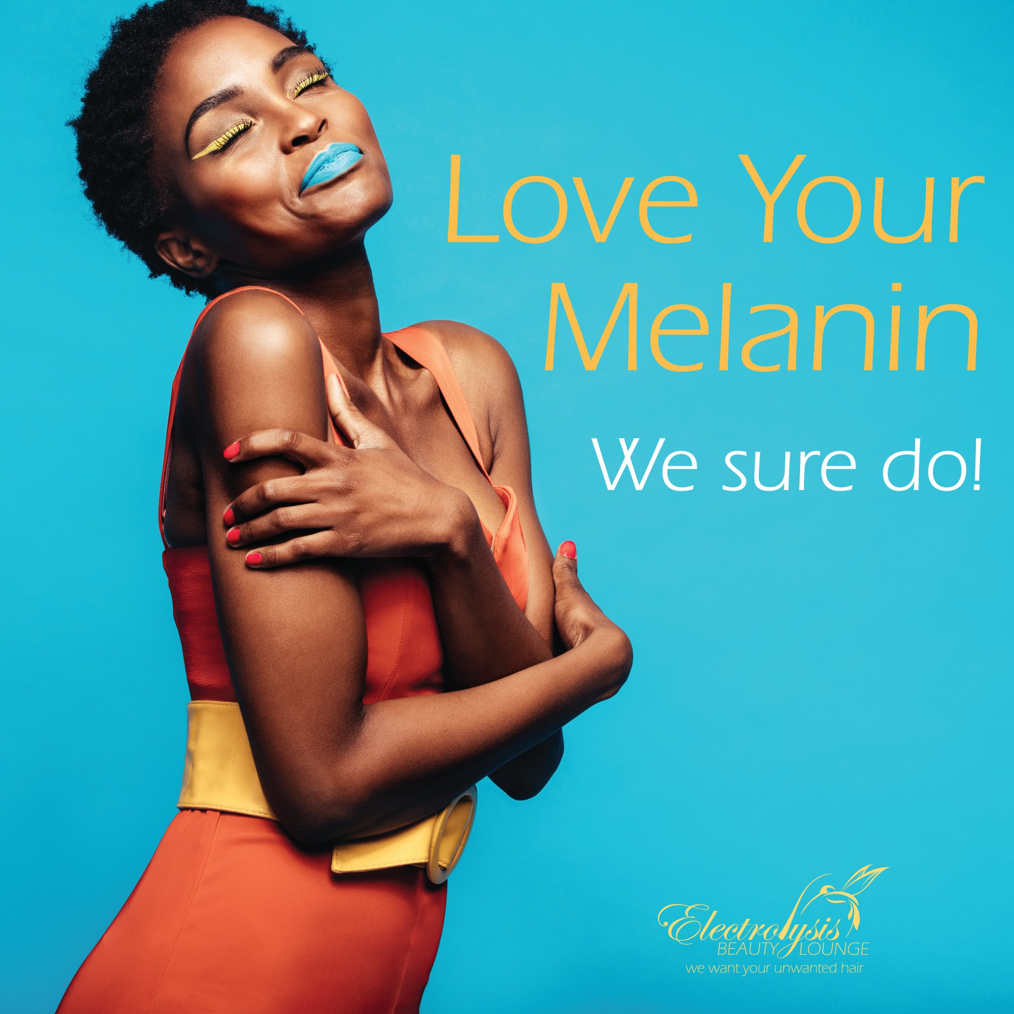
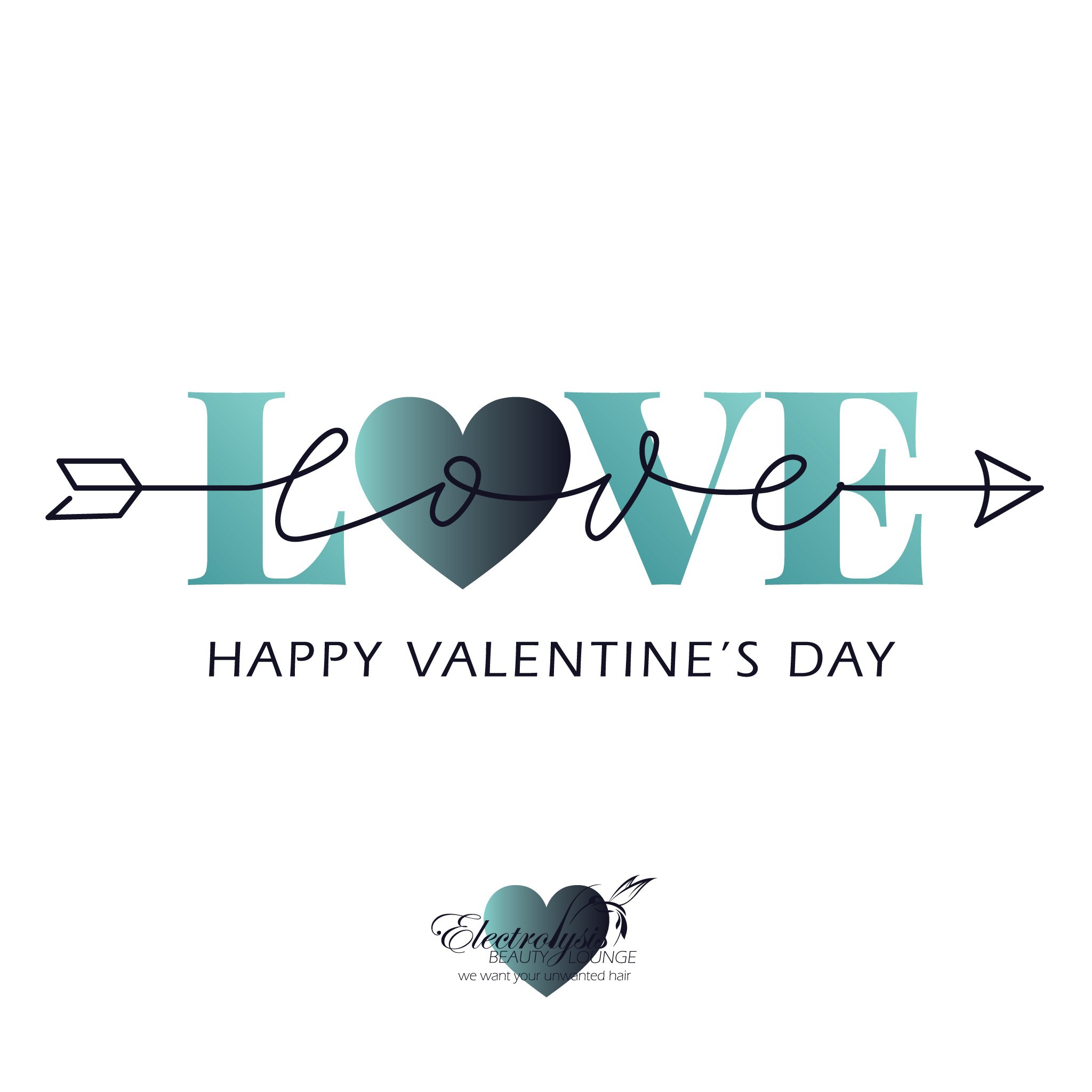
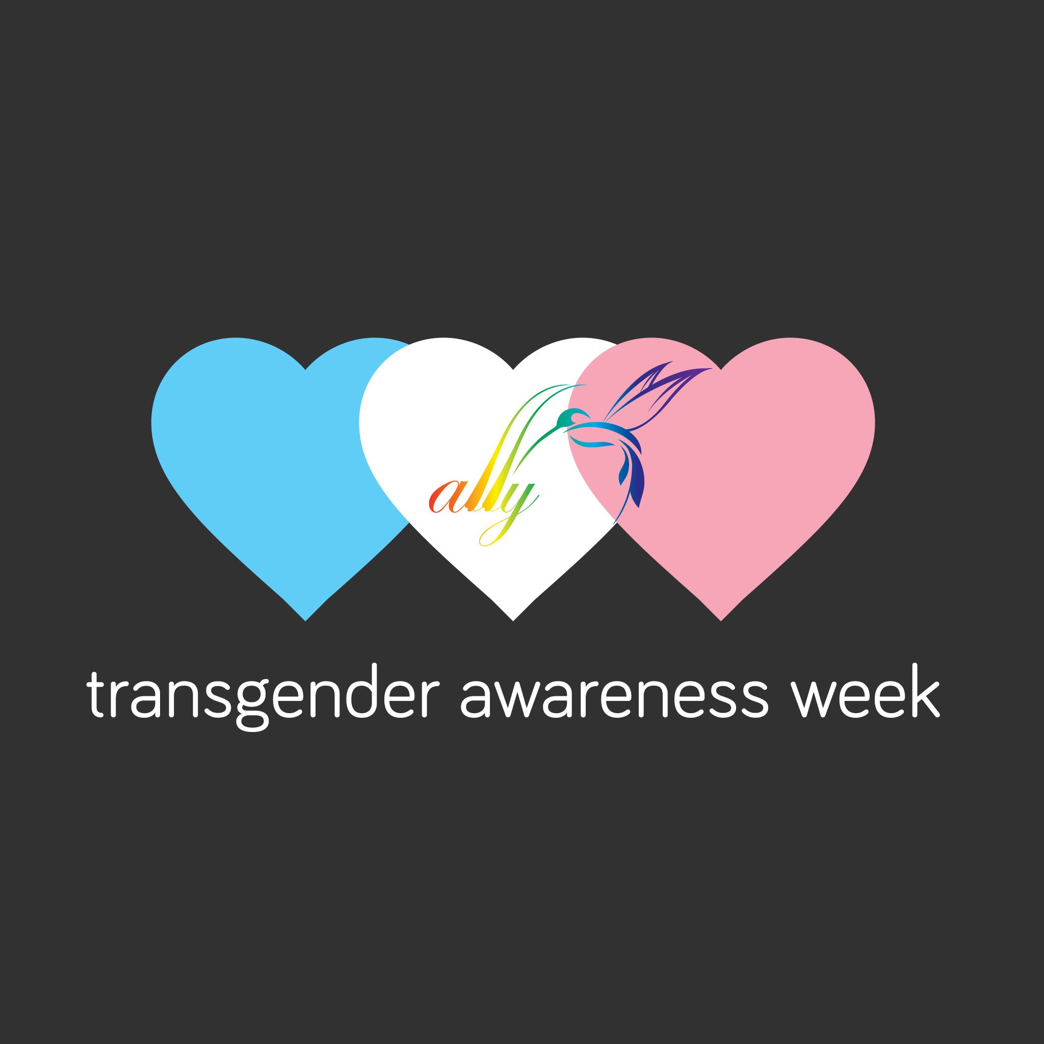
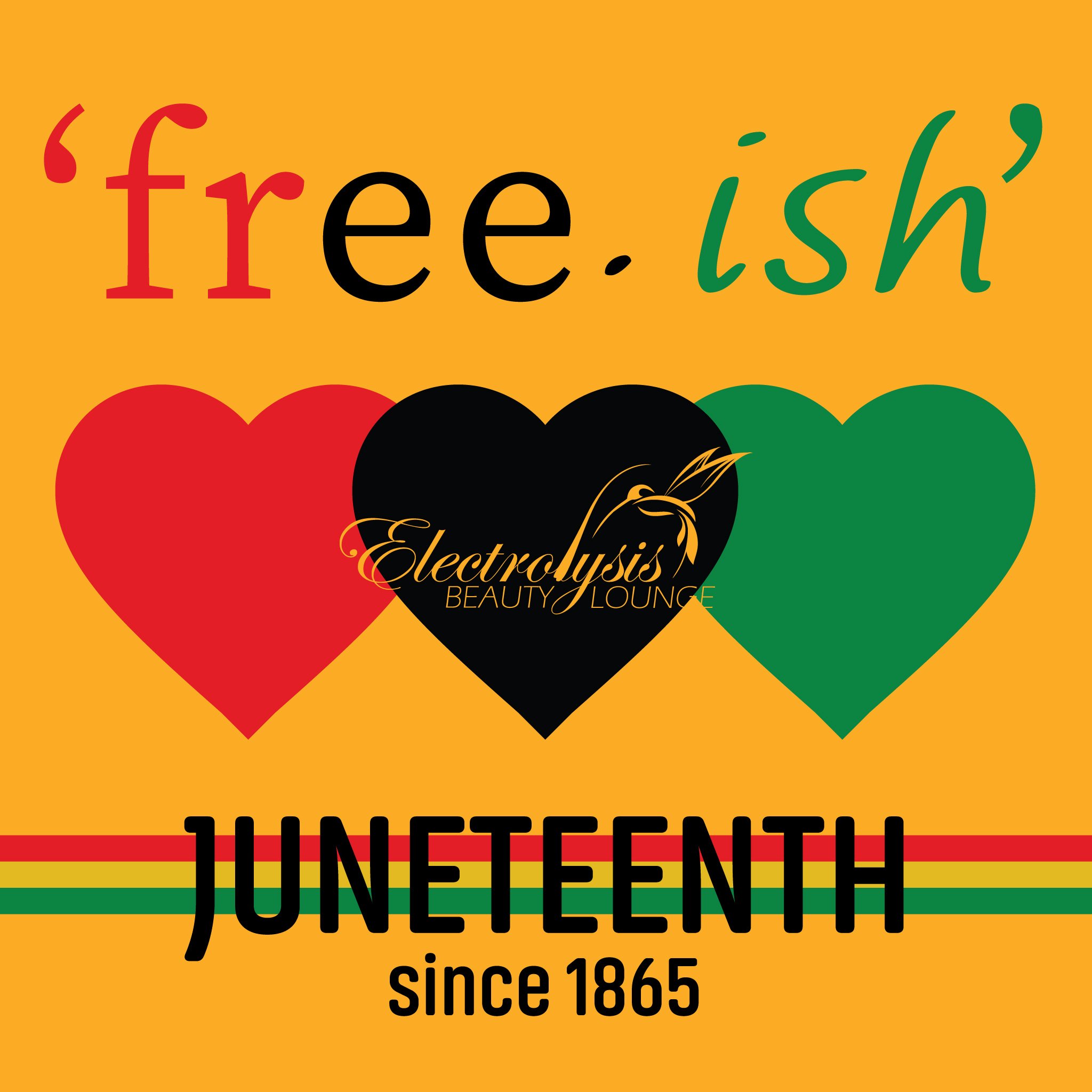
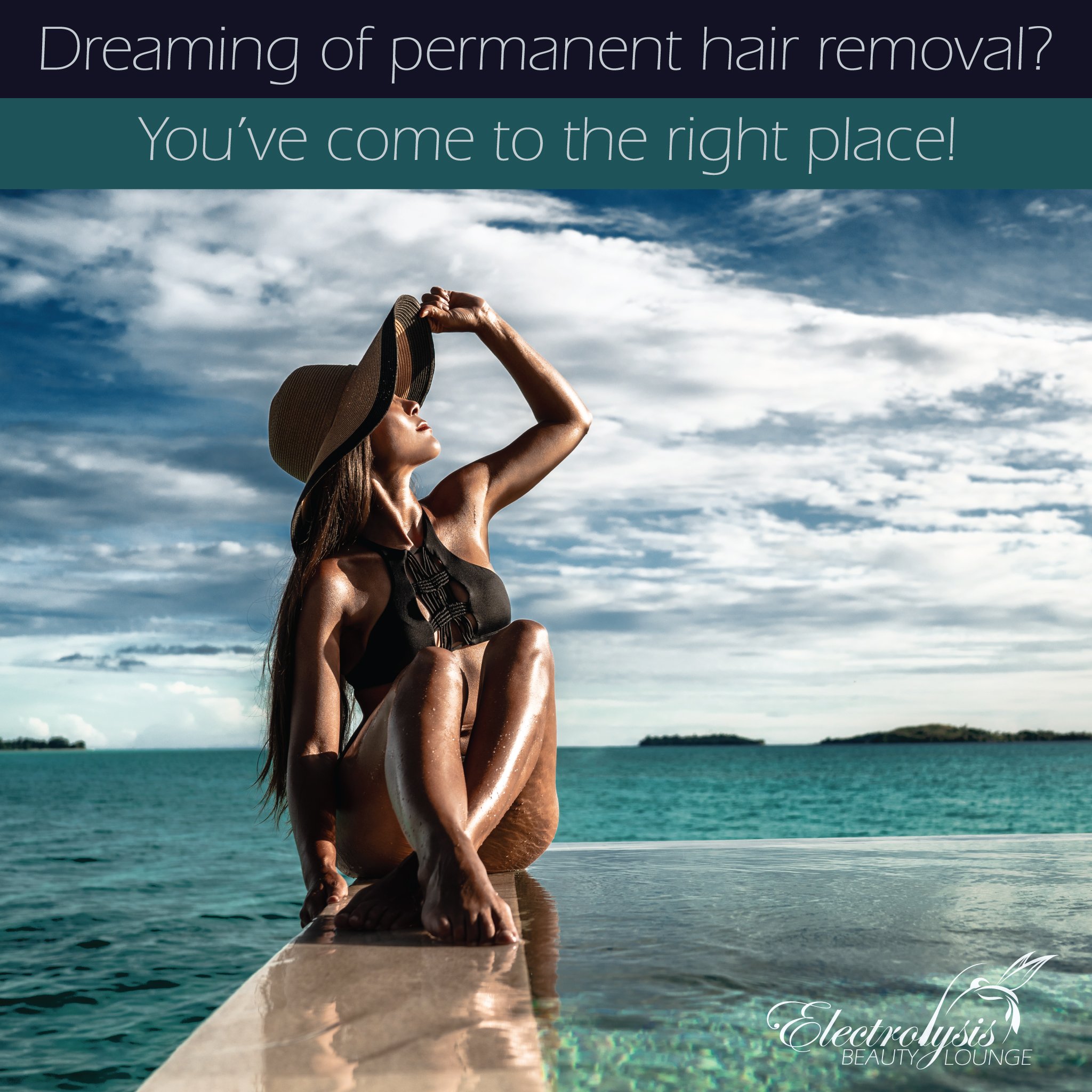
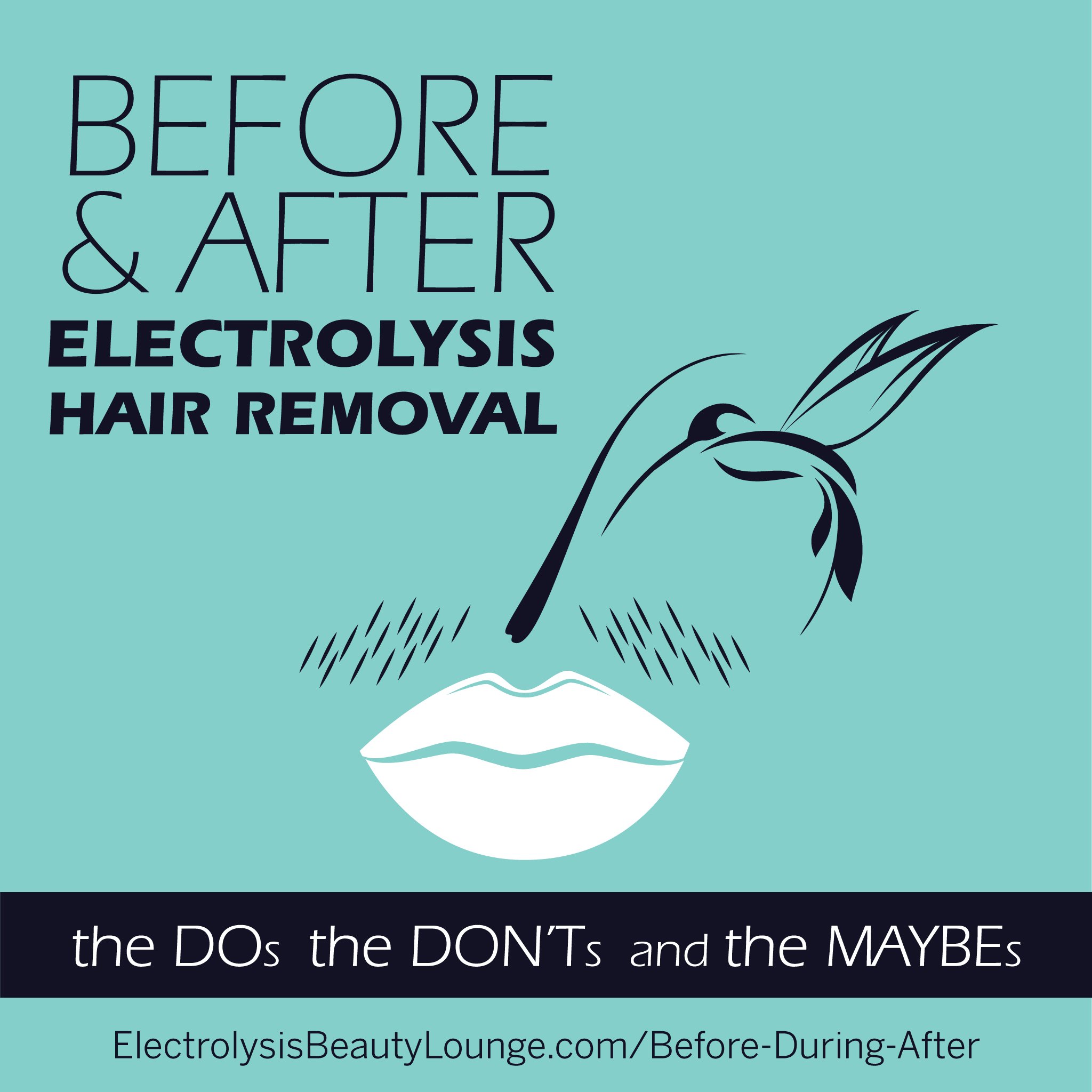
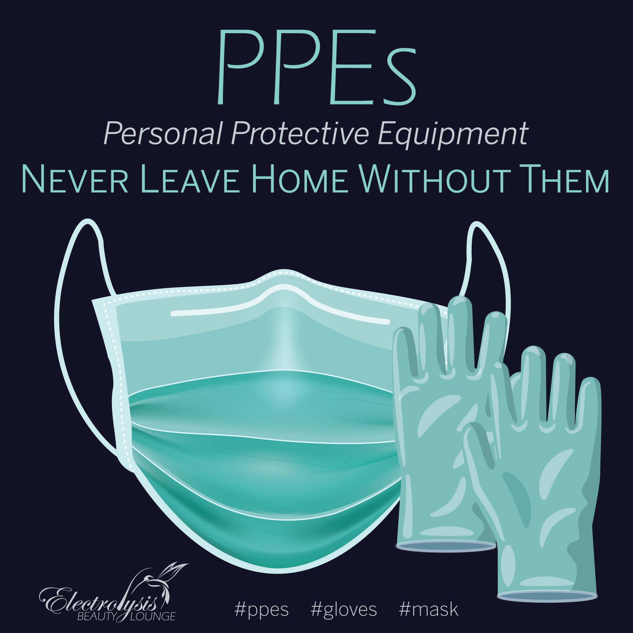
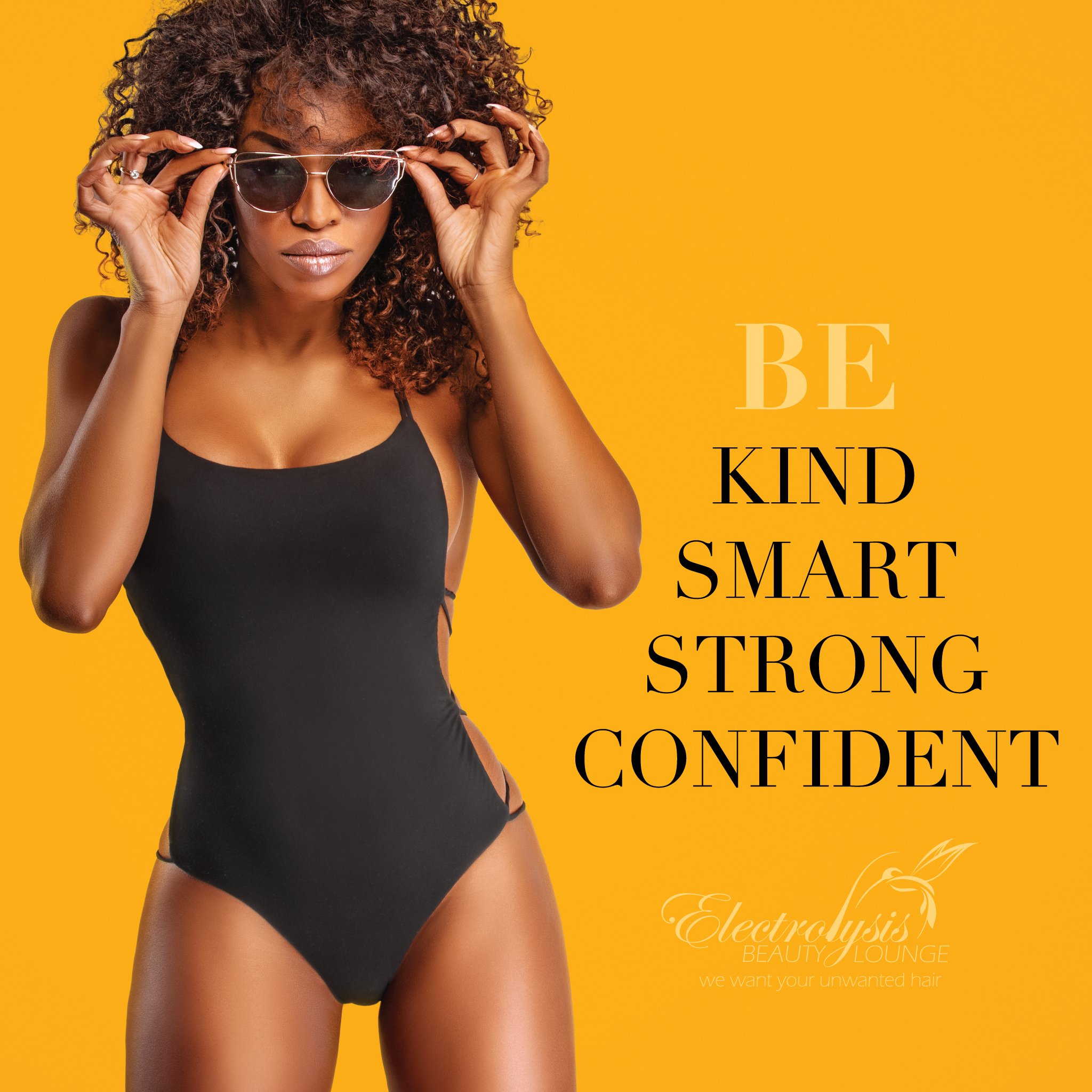
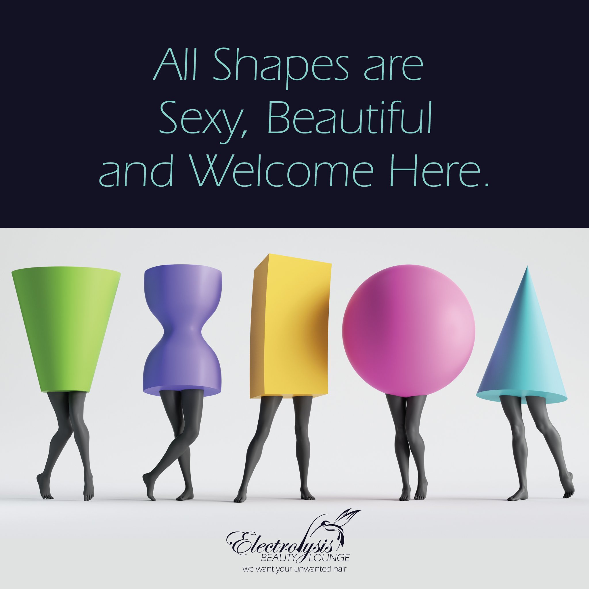
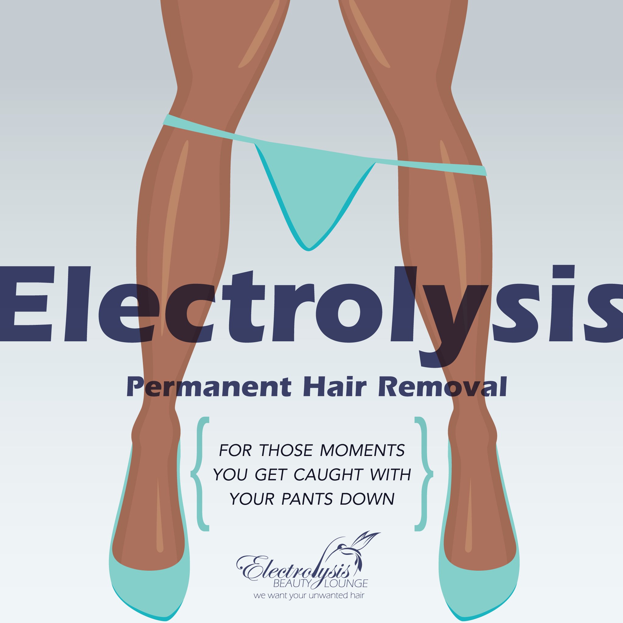
we wanted the client’s social media to mirror the website’s focus on education so we design all posts to be both informative & clever with an touch of humor.
-
print.
-
the client’s business card uses a simple design that includes a qr code for easy website access. the feel of the card has a treatment that makes it feel exceptionally smooth, just like what the skin feels like after all rounds of electrolysis treatments are completed.
-
client forms were created to collect electrolysis client health history, treatment chart info and session notes.
beware of laser. @the root of it.
[ sub-brands of electrolysis beauty lounge. ]
services. [ logo. website. social media. ]
logo. website.
-
the client has a sub-brand that needed it’s own identity to educate and warn those seeking laser hair removal so they are fully informed about the risks. we thought it best to use the primary message as the logo itself to immediately attract attention.
we also settled on universal warning colors for the brand’s color palette.
we also created a logo for @therootofit, a sub-brand used across social media when getting to the root of both electrolysis and laser hair removal facts.
-
the website was designed to focus on educating the public, therefore it’s copy heavy.
we also included a form for users to share their story if they suffered negative side-effects from laser hair removal as well as the ability to sign a petition requesting federal control functions to hold the laser hair industry accountable & responsible for informing the public about the risks.
-
social.
-
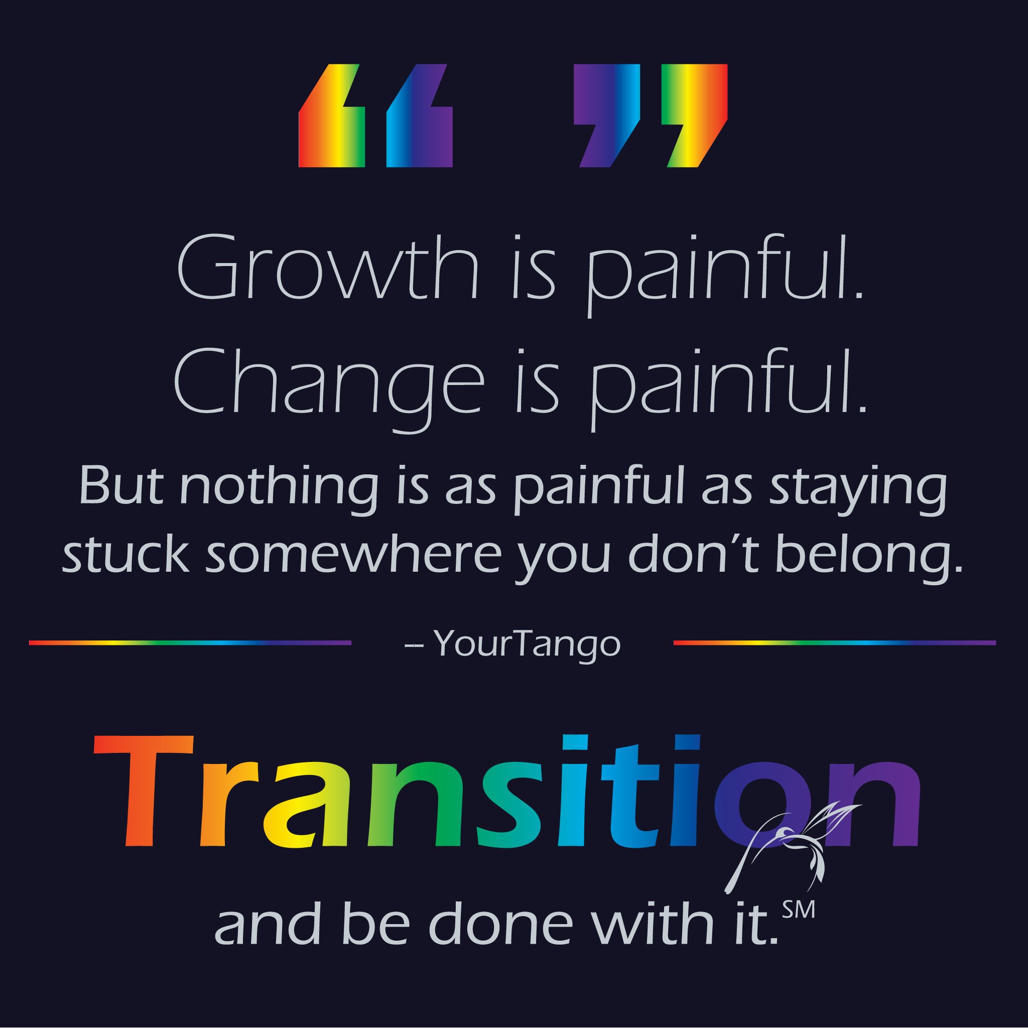
these social media posts supports both sub-brand’s messaging and purpose. they are used on the electrolysis beauty lounge social media pages.